Loading Portfolio

For Best

experience

login

through desktop

My Portfolio

Smart Food Safe

Smart Food Safe is a supplier compliance dashboard designed to simplify food safety operations through centralized query management, certificate tracking, and risk-based monitoring. The experience focuses on intuitive navigation, clear information hierarchy, and data-driven workflows that enable teams to manage supplier compliance efficiently.


By bringing supplier communication, compliance status, and critical actions into a single platform, the dashboard helps Quality Assurance teams improve visibility, streamline daily operations, and make informed decisions with confidence.

See It in Figma

MediScan

MediScan is an AI-powered healthcare companion designed to simplify how users manage and understand their medical records. The experience focuses on clean UI, intuitive navigation, and transforming complex reports into easy-to-read health insights.


By combining AI-powered explanations, organized report management, and personalized health summaries, MediScan helps users confidently track their health while making medical information more accessible and actionable.

See It in Figma

Fix the Rush: POS Bill Split

A POS redesign that helps restaurant servers split complex bills in under 2 minutes — without losing track of modified orders, cancelled items, or who owes what.


Built on Material Design 3 for tablet, the flow lets servers group seats into bills in one action, flags voided and replaced items with clear visual badges, and closes with a per-bill success confirmation.

See It in Figma

Runvelle

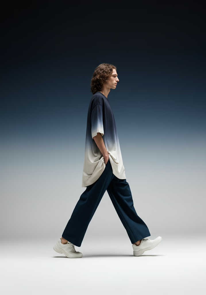
Runvelle is a modern online fashion platform designed to blend style with seamless shopping. The experience focuses on clean UI, intuitive navigation, and a visually immersive product journey.


A standout interaction on the product detail page allows users to scroll through models, with the featured outfit dynamically updating based on what each model is wearing - creating a fluid, context-driven shopping experience that feels both interactive and intuitive.

See It in Figma

PATA

PATA is an in-house website designed for our independent music production house. Built with a bold, modern UI, the experience reflects the band’s identity while maintaining clarity and structure.


The site features custom transition screens between pages for a cinematic flow, along with interactive spotlight hover effects on key titles - creating a dynamic, performance-inspired digital presence.

See It in Figma

2+ Years Experience

My Skills

Web

Design

Mobile

Design

User
Experience

Design

System

User

Research

User

Persona

Empathy

Mapping

Sketching

Mockup

Wireframing

Prototyping

Usability

Testing

Presentation

Graphic

Designing

HTML

CSS

JavaScript (Basic)

Strapi CMS

Design Thinking

Interaction Design

My Design Stack

  • 2+ years of turning

    CHAOS

    into

    CLARITY

    through strategic design. Interfaces that don’t just look good, they

    PERFORM.

    2+ years of turning

    CHAOS

    into

    CLARITY

    through strategic design. Interfaces that don’t just look good, they

    PERFORM.

    2+ years of turning

    CHAOS

    into

    CLARITY

    through strategic design. Interfaces that don’t just look good, they

    PERFORM.

    2+ years of turning

    CHAOS

    into

    CLARITY

    through strategic design. Interfaces that don’t just look good, they

    PERFORM.

  • 2+ years of turning

    CHAOS

    into

    CLARITY

    through strategic design. Interfaces that don’t just look good, they

    PERFORM.

    2+ years of turning

    CHAOS

    into

    CLARITY

    through strategic design. Interfaces that don’t just look good, they

    PERFORM.

    2+ years of turning

    CHAOS

    into

    CLARITY

    through strategic design. Interfaces that don’t just look good, they

    PERFORM.

    2+ years of turning

    CHAOS

    into

    CLARITY

    through strategic design. Interfaces that don’t just look good, they

    PERFORM.

2+ years of turning CHAOS into CLARITY through strategic design.
Interfaces that don’t just look good, they PERFORM.

Hello.

I'm Karthik Sherkar M S

UI/UX Designer

For Best

experience

login

through desktop